Friday, December 09, 2011

" Blue Iris and Oriental Poppy" 5 x 7 each Colored Pencil on Stonehenge Drawing Paper


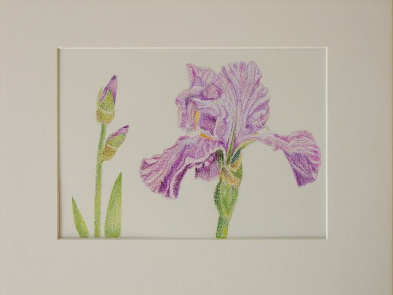
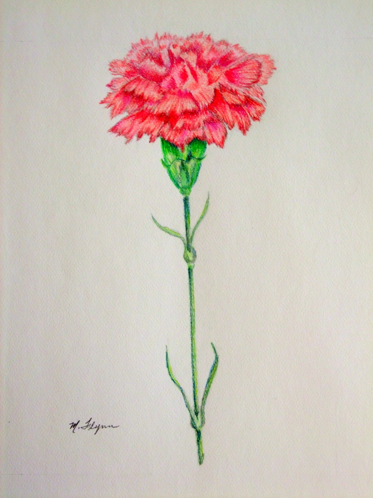
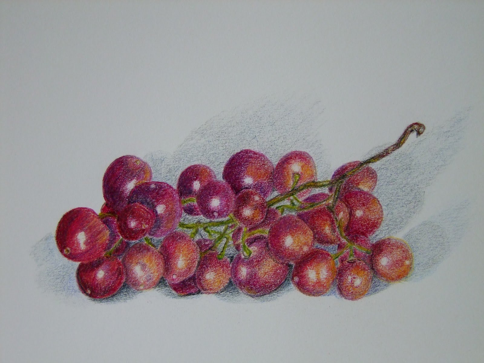
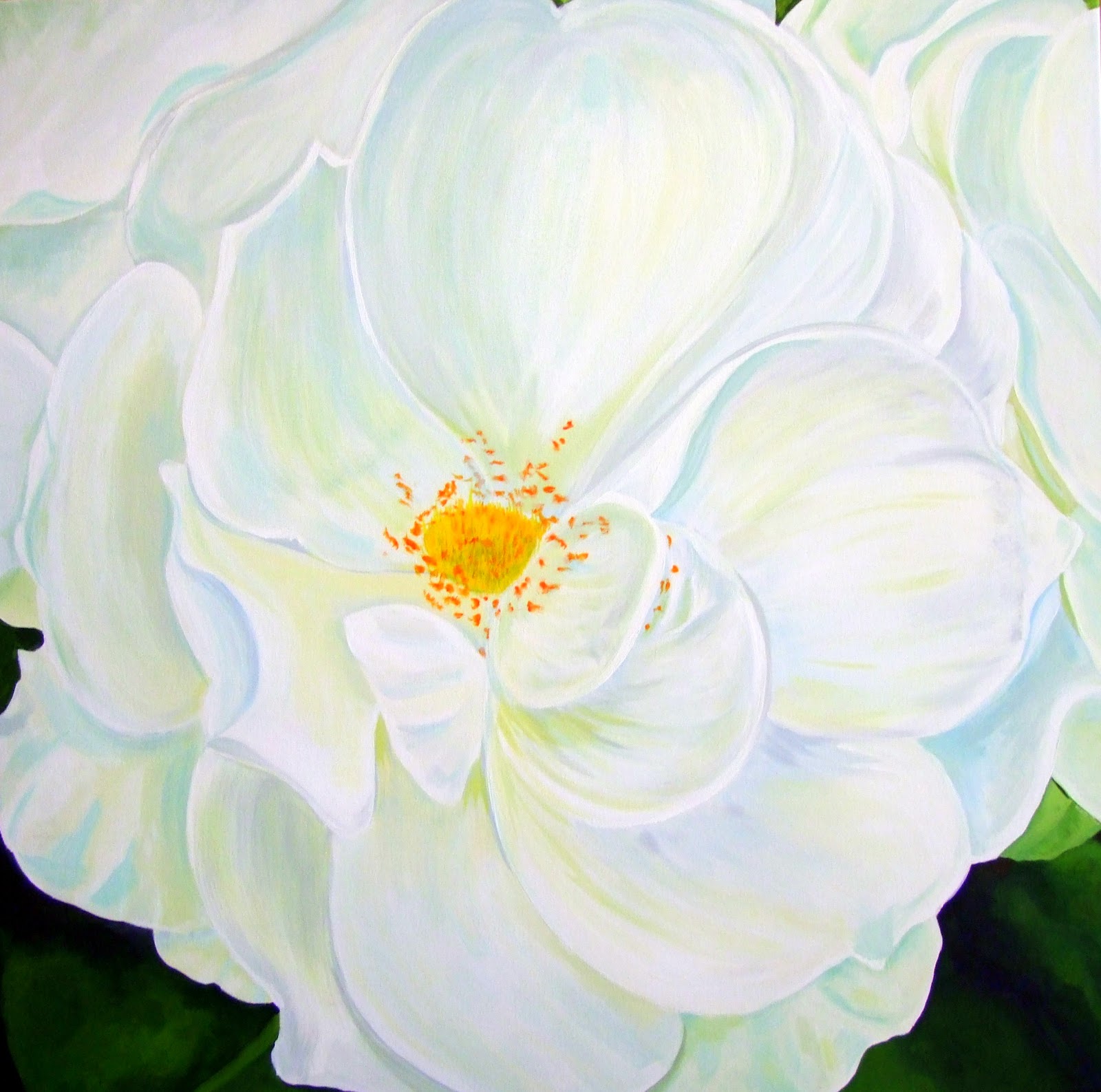
I must apologize again for the poor quality of these photos, but I was in a bit of a rush taking them with my camera and fumbling with the settings before heading out of the house Wednesday morning. I was taking these two framed drawings to the Silent Auction at my workplace before 9am. The money from the proceeds are to go to a charity organization in Calgary that looks after the homeless.  These two colored pencil drawings are the second set of drawings that I decided to donate to the auction as oppose to the first set that I posted earlier in my blog. I also decided to change things a little from the first set, to the second set, which I think makes them look much better overall. Wednesday at the auction, the bid on these two did quite well. I was not expecting them to go as high as I thought they would for small drawings such as these. They are only 5"x7" each inside the matting and they went to the final bidder at $80.00 for the pair. I suppose they could have raised more money if they had separate bids placed on them, but my intention was to keep them together as a pair. The most important thing in the end is that the money went to a very good cause. That's what really matters.


Thursday, November 24, 2011

"Salvaged" 16 x 20 Acrylic on Canvas


I originally began working on this painting back in the Spring of this year. At the time, I had a strong desire to paint a still life composition but I wanted to paint it from life rather than using a photo. Again, I visited the local Salvage Centre to see if I could find a few interesting objects to use in my painting. A Salvage Centre can be a fun place to find just about anything. Some unwanted stuff that I had found there as I was browsing, can be reused and recycled if they are in relatively good shape. If I find something that I like by way of color or that I find the shape interesting, I'll buy it. I know that at some point, I'll make use of it in my paintings. Pictured here is a tall blue vase, a small terra cotta cup with some fake flowers, a lovely butter yellow teapot (love the colour too!), a fake red leaf and a few polished stones. Everything here has a connection to each other, all are discarded and all are found again. Showcasing them in a painting, makes them loved.

Sunday, November 13, 2011

"Roses" Botanical Art 8x10 Colored Pencil on Canson Drawing Paper


My colored pencil drawing that I was working on in the Studio on Sundays, is finally finished and I am enjoying how it looks. I particularly like how the larger leaves have some holes in it made by an insect or worm and it's browning leaves.  A touch of whimsy I think which adds to the realistic appeal to the drawing. I considered adding a small bug on a leaf but that may have detracted from the flowers. I may try that next time. I'm not certain what type of Roses these are but I think they are a vintage old world garden variety type.The drawing looks very nice in it's dark ebony frame below.


Tuesday, November 08, 2011

"A Work in Progress & Sunday in the Studio"


It seems that it has been a few weeks since my last posting and I thought that I should try to put something in soon or run the risk of having no one visiting my blog. I haven't forgotten my blog but lately, I've been very busy with other things that forced me to put aside doing my art work for a little while. I've recently started this colored pencil drawing of Roses, working on it every now and then when I have some free time.  I started up an art group a little more than a month ago and we get together every Sunday afternoon in a rented Studio space close to down town. Each artist work on their art in the studio for a 3 hour period.  I've been bringing my rose drawing for the last couple of weeks to the Studio and wondering if I'll ever finish it. I'm working on it slowly.  I do like how it looks so far and I hope to have it posted soon.


The Studio we rented above is in the Kensington area of the city. It's a trendy neighbourhood of artists and artisans, cafes, shops and restaurants. The studio is well lit and is comfortable to work in. 


The other side of the studio space.


This lovely lady is my artist friend, Kate.  She loves to paint horses, which you can see the horse painting she's currently working on, on the easel beside her. She's very good!


Another lovely lady in my group is my artist friend, Dayna. She's an expert watercolorist, among other artistic endeavors.


I'm suppose to be in this photo but I didn't want to disturb anyone into taking my picture so instead I took a picture of my workspace and supplies. I was really there! Honest! Next Sunday, I'll have to get someone to agree to take my picture.  That's all for now.


Saturday, October 15, 2011

"Choke Cherry Branch 2" 12 x 12 Acrylic on Canvas (Framed)


This is the second choke cherry painting. I've been working on it for most of the week, taking breaks from it every now and then. I already had the second frame and canvas that is the same size as the first and thought it would be nice to paint another one by extending the branches out further. What I like about these two paintings is how your eyes want to scan the whole image and looking into the depth between each branch and a thought, if I wanted to, I could go all out by adding more 12 x 12 branch paintings and eventually do the whole bush! HA!  That might look real cool, but a lot of work. I may consider that at a later time, for now I'm satisfied with how it turned out.  Enjoy!


Saturday, October 08, 2011

"Choke Cherry Branch" 12x12 Acrylic on Canvas (Framed)


Just a little over a month ago, my husband and I and two of our friends, went out on a day trip to the Sheep River Valley. We made several stops to admire the views and take some pictures. It was a nice warm sunny day and the Fall colors hadn't really started yet, everything was still green. As we all walked along the banks of the Sheep River, I came up to a cluster of Choke Cherry shrubs. I thought they were beautiful because I liked how the little red berries made a nice contrast against the green leaves. Naturally, I took a picture of it. A couple of weeks ago, I formed an art group which meets to paint together weekly in a rented Studio space.  Last Sunday was our first painting session as a group and as anxious as I was, I was having some difficulties deciding what to bring with me to paint for my first session. Earlier in the day, I noticed the picture I took of the Choke Cherry shrub among other photos, just lying off to the side on my drafting table all this time. I guess I had forgotten about it. I took it with me to the Studio. Sure glad I did, I think it turned out well. 


Tuesday, September 27, 2011

"Red Poppy & Buds" 5x7 Colored Pencils on Canson Mi-Tients Paper


I decided to draw this poppy and the buds as the second in my framed floral series. I really like to draw poppy flowers, they are easy for me to draw and this one was from a photo that I have in my collection of flower photos.  It looks very nice in the frame below and I may do several more. It may just end up going to the same auction for charity as the Blue Iris I did last month. I'm pleased with the way it turned out on the paper. Hope you like this one.


Tuesday, August 23, 2011

"Purple Iris" 5x7 Colored Pencils on Canson Mi-Tients Paper


I've just completed this new botanical pencil drawing of a Purple Iris and bud. I'm thinking that this could be the best floral drawing that I've done so far. It's the first of two botanical drawings that I am working on and both will be going to a silent auction to raise money for charity later this year.


Here it is matted and framed. The drawing looks pale from this photo at the moment but that's because I placed a piece of Vellum over the image to protect it until the auction. I put my signature and title of the drawing on the matte just slightly below the image. It keeps it clean of any writing on the drawing.
It looks so beautiful, that it will be hard for me to give it away when the time comes, but the money will go to a very good cause and it will be all worth it.

Saturday, August 13, 2011

"Western Red Lily" (Prairie Lily) 9x12 Colored Pencils on Strathmore Pastel Paper

This drawing of a Western Red Lily, is the floral emblem of the Province of Saskatchewan, adopted in 1941.
They grow in wooded areas, meadows and along roadsides. They range in color from a light yellow-orange to a bright red and can grow up to 5 feet high. The lily is a protected species in Saskatchewan and there is a penalty if caught picking one. I drew this lily from a photo that I had and the color of it was more on the orange side. They are known as being both beautiful and showy. This is the third drawing in the series.

Monday, August 08, 2011

"Pacific Dogwood" 9x12 Colored Pencils on Strathmore Pastel Paper


The Pacific Dogwood is British Columbia's floral emblem, adopted in 1956. The Dogwood tree is found mostly along the coastal mainland and in the southern portion of Vancouver Island. The flowers bloom in April and May and a tree in full bloom is quite a beautiful sight to see. I drew this flower as part of a series of Provincial Floral Emblems of Canada that I am hoping to accomplish this year. This is the second and I would have 8 more to go, and if it goes well, perhaps include the Northern Territories as well. This drawing was a real treat. I really love how it looks on the paper and I'm looking forward to do the next one.


Monday, August 01, 2011

"A Welcomed Guest" 20x20 Acrylic on canvas

This is my first attempt at painting a seascape with rocks. It looks somewhat abstract, and to me, not really my best work but I do like the composition and the bright colors in it. Looking at it now, I suppose it may not look so much like a vast ocean especially with the background land mass in the distance being so close, but I was thinking that it might thought of as a small part of the ocean landscape, such as part of an inlet or cove where you would find rocks such as these, with small waves crashing on them, on a windy day. The small dark grassy area behind the base of the rocks would make a good sheltering spot away from the wind and waves. The seagulls were an after thought. A touch of whimsy to add to the painting. If I had one, this piece would look nice on a wall in a summer cottage.     

Saturday, July 30, 2011

"A Quite Corner" 24x24 Acrylic on canvas


This painting is from a photo that I had of one of the gardens, at 3 Valley Gap in B.C. My husband and I were passing by along the Trans-Canada highway on our way home from vacation in June of this year. We often stop there to take a few photos and enjoy the view of the lake before continuing on. There's a large hotel there and anyone who has ever stopped or stayed there, can appreciate the wonderful work they do with the gardens. It's well worth the stop. I would say that it is a floral painter's haven. You can spend a lot of time there painting small quite sections of the flower beds or painting the great views of the lake and surrounding mountains. I was just thinking that this area would make a nice destination to go to, to attend a painting workshop. Any artist's out there listening!  As for this painting, it's painted loosely and I just had to capture the Lupins in it, which were huge at the time I photographed them. It reminds me of a Gauguin style painting. I will have to do more garden paintings, they're fun to do and a real challenge at the same time. 

Wednesday, July 27, 2011

"Granny Apple Trio" 11x14 Colored Pencil Study on Canson Paper


Oh no, more fruit! Yes, more fruit. I'm having alot of fun drawing fruit with my colored pencils these days. They are actually relatively simple to draw as you don't have to get the shapes down perfectly. Although, the lone apple on the left does look more like a kiwi then an apple. Now there's a thought! Ah! Just kidding!  The hard and tedious part of coloring is all the layering as you know. That takes more time and effort in order to make them look real. If you are wondering what kind of colored pencils I use, not to sound like an advert, but I like using Faber-Castell Polychromos Pencils. They are oil based pencils and don't produce a wax bloom on your work. I do have some other varieties of colored pencils that I sometimes use but Faber works best for me. As for my next post, I did a little painting with my acrylics and I'm just finishing  that now. And, no, its not fruit.  Stay turned for the next one.  

Saturday, July 23, 2011

"Carnation" 9x12 Colored Pencil Study on Strathmore Pastel Paper

A few days ago, I bought a small bunch of carnations. As I was preparing to place them in a vase, I remembered seeing those beautiful books on flowers that are drawn by botanical artists. They are flowers drawn in intricate detail on white paper. I really love seeing those types of drawings and in my own attempt to try to acheive in producing the same kind of floral art as the experts, I chose a single carnation out of the bunch, held it in my hand and began to draw it with my colored pencils. It's not that easy to keep on holding it while drawing, but I was able to manage it. Anyway, this is the result. Not too bad, I think!

Sunday, July 17, 2011

"Found Objects and Yellow Daisies" 12x16 Colored Pencils on Canson drawing paper


My latest Still Life colored pencil drawing, features found objects that I picked up at a thrift store for under a dollar each. The small orange cup to the left is a pottery piece made by someone who obviously didn't like how their piece turned out. It looks a little crooked but I still like it and wanted to keep true to its form. The blue vase is also a hand made piece and the green vase is factory made and both are crooked as well. No matter, found objects together can make a nice drawing or painting. They add interest and make a pleasing composition by way of color and form. I added a few yellow daisies that I bought from the grocery store and voila! I enjoyed working on this drawing but I have to admit that with my busy schedule, it took over a week to complete and I was getting a little tired, and now, I am anxious to move on to something else. 

Tuesday, July 05, 2011

"Wild Rose" 6x8 Colored Pencil Study on Strathmore Pastel Paper


To start off the month of July, I decided to draw this wild rose. They are the floral emblem of the province of Alberta, in Canada, adopted in 1930. They are a flowering shrub and seem to grow everywhere in Alberta. They bloom from late May and last until early August. What I didn't know about them is that the wild rose can be used in the manufacture of perfume. It's no wonder, they smell so nice! I used a 9x12 green pastel paper which compliments the colors in the drawing and I used lots of layering of different colors of greens and pinks to enrich all the tones. This drawing was a fun piece to do.

Tuesday, June 28, 2011

"Oranges" Colored Pencil Study on 11x14 Canson drawing paper


I just finished drawing these oranges that I had on my drafting table tonight. I borrowed a library book on colored pencil techniques and decided to give it a try. The book looked very interesting and the images appealed to me. This is the result. I really like the way it turned out. I find the oranges look more realistic using the methods that was suggested in the book. I drew these always late in the day so I could take advantage of this kind of light. It made the shadows longer and much stronger. I did change a few things that I wanted to do using my own methods of drawing and I also wanted to give the drawing a little of an abstract contemporary feel at the same time by using different colors to fill in the shadows. Giving it a more modern look, I think made it challenging and fun.

Sunday, June 26, 2011

"Red Grapes" Colored Pencil Study on 9x12 Canson drawing paper


I finished my drawing this morning. When I got up, it was cloudy and raining and still is at the moment, so you must forgive me on the exposure of the image. It was an interesting challenge for me tackling these grapes. For one thing, as I was drawing one grape at a time, I was thinking, oh boy, I have 20 more to go, this may take some time to complete. But, it wasn't so bad and I was able to complete it in just a few days. I know that for some experienced artists, drawing time for them is faster. One thing is true about doing colored pencils, it's a slower medium that you just can't rush. You have to be relaxed and willing to take the time on your drawing, thinking things out thoroughly. My next drawing project will be oranges. I want to try to complete a fruit series and have them framed, all in the same type of frame so that they all match. That will be my new goal for the next little while.

Saturday, June 25, 2011

"Grapes" Work in Progress 2


I worked most of last night on this second part of my drawing. Just a few more grapes to work on and more shadows to do on the table. It's very bright in my Studio right now and the grapes are sitting on my drafting table. The shadows are not really that strong, just mostly at the bottom and inside where the stem is, along the center. At this point, I'm not sure whether I should add more grapes to the center because I feel it doesn't seem complete. I'm not sure if just making it look darker is the answer either. Well, I'll just keep working on it and see what kind of result I'll end up with. It's a good thing that it's fairly easy to erase and make changes as you want to, that's what I like about doing Art.

Thursday, June 23, 2011

"Grapes" Work in Progress


Tonight, I am sitting at my drafting table in my studio, and I'm drawing these grapes that I picked up at the grocery store earlier in the week. They are red imported grapes from the U.S.A and they taste sweet. I wanted to show that much like in painting, where you would perhaps do an under painting to tone your image before actually applying color to it, the same can apply using colored pencils as I've done here. I'm using a sheet of Canson Mi-Teints paper, which is my favorite paper to use for colored pencils. I hope you'll visit my blog to see the end result of this drawing.

Tuesday, June 21, 2011

"Apple Trio" 11x14 Colored Pencil Study on Canson Drawing Paper


These apples may look a little odd, and that's because they were a little odd looking. I had acquired them at the front desk of my hotel in Victoria while on vacation. The hotel always keeps a bowl of fresh apples for hotel guests to take with them to their rooms or when going out. It's a thoughtful and appreciated service.
I began drawing these while on vacation and then ended up finishing them after I got home. The look of the apples themselves are what inspired me to draw them. Their skins were heavily veined with yellow patches on them, as well as having odd shapes. They made for interesting subjects to draw or paint. I like how this drawing seems to have an abstract quality to it. 
Soon I'll be thinking about what to do next, more veggies maybe?
  

Tuesday, June 14, 2011

"Comox Harbour,Looking East" 16x20 Acrylic on canvas


I'm still on vacation at the moment and it's great that our hotel has free Wi-Fi connection for the Internet. I'm taking advantage of it and posting this commissioned painting I did about 2 years ago for a couple who live in the Comox region on Vancouver Island. I had a chance to take a picture of it which is hung up in their living room. What luck, I thought! The painting is taken from Comox Harbour, at the east end of the harbour where you can see just a few sailing boats, a forested area and the mountains in the distance. At the time, I was standing on the docks when I took the picture which was close to 9pm in the evening in August and the sun was just setting in the west. I remembered how lovely the whole scene looked at the time. I'm glad I now have the chance to show this painting on my blog, hope you like it.

Sunday, May 29, 2011

"Final Day of Acrylic Workshop"

It was day 2 and the final day of our workshop. Here we all are busy working on our paintings. You can see my pine easel with a carpet on the floor below it just to the right of the photo. Our instructor visited each and every one of us to see if we were doing alright.

Here, our instructor and artist, David Langevin, is demonstrating the application of glazes and veils using acrylic paint and glazing mediums. He applied the glazes in thin layers to the textures on the canvas and eventually building up more and more layers with different colors of paints and glazes until the painting is complete. We had to make sure to write everything down and to observe the process carefully before going back to our easels. Its not that easy to do this proceedure and takes some practice.


Here is the beginning stage of my highly textural painting. Spruce Trees is what we all did.  I went a little overboard on the molding paste but I love the texture I created with it.

Here is the next stage, with some of the glazes on. It looks strange at this point but is suppose to look better as you keep glazeing color on top of color. It's a fairly long process for a canvas this size which is 12"x30".

Kind of the finished product. I say "kind of" because I would have liked more time to work on it. I think I did everything right but I can't say that I really like my work on this painting. I know I could have done better if I had more time to work on it and at my own pace. But we were all there to learn new techniques and not create masterpieces as such, but rather create future ones using David's tips and techniques on glazes. This was a very enjoyable and informative weekend and I am hoping to be able to take more workshops with David in the future.
If you would like to visit David Langevin's website and see all of his beautiful paintings,
 just google David Langevin.com

Saturday, May 28, 2011

" Weekend Acrylic Workshop at Leading Edge Workshop and Gallery"

This is day one of a workshop I am taking at Leading Edge Workshops here in Calgary. In this picture we are just setting up. We have a large group of artists in attendance to learn painting techniques from one of Canada's premiere Master artist, David Langevin.

In this photo, David is showing students his techniques in using various painting mediums to show special textural effects such as Tar Gels, Molding Pastes and liquid polymers to use in a painting.

Here, David is demonstrating the use of  transparent glazes and veils, which he uses in all of his paintings. I am enjoying this workshop very much. David is a very knowledgeable and accomplished Artist.

Monday, May 23, 2011

"Banana Trio" 9x12 Colored Pencil Study on Strathmore Pastel Paper


I really like this colored pencil drawing of bananas that I did yesterday. I drew it from life on my drafting table. I bought a new drawing pad from my art supply store and a few new pencils to try out. The paper pad is very nice. The paper has a medium tooth to it and comes in very nice pastel colors, which I think acts as a nice compliment to the colors in the artwork. Because the drawing is still in the pad, the store clerk suggested I place tracing paper on top of it to protect it until I'm ready to use a fixative on it. I think that's a very good idea and one that I haven't thought of before, especially for my pencils which are oil based.
I am feeling more confident now with my pencils and I am already thinking about doing a still life arrangement of fruit on a table as one of my future colored pencil drawings. A big project!  I'll see how that goes.

Tuesday, May 17, 2011

"Pink Tulips" 11x14 Colored Pencils on Classic Cream Canson Drawing Paper

Here's another colored pencil drawing that I decided to do. Because I am still just practiceing my drawing skills with my colored pencils, I wanted to take on something a little more challenging this time and a little larger image to work with. I found a wonderful book at my public library on floral templates for artists. I tried to follow the image as best I could and changed some of the positions of the leaves and tulips to make the image more my own. The idea here is to just practice layering techniques for the moment until I can achieve a more smoother appearance to the subject. At least I am hoping that it will turn out that way.

Saturday, May 14, 2011

"The Perfect Pepper" 8x10.5 Colored Pencil Study on Canson Classic Cream Drawing Paper


One day last week, as I was planning dinner, I asked my husband to go to the grocery store and pick up a pepper. When he returned, he proudly handed me the pepper, calling it "The Perfect Pepper". It did look perfect and I admit I was hard pressed to cut it up because I had visions to paint it instead. Needless to say, I held it back from my dinner plans and the next day I drew it.  It has been a very long time since I picked up my colored pencils again. I wasn't sure if I was going to pull it off. There were some things that I had learned from the past that I had forgotten but at the same time, I realized just how much I enjoyed drawing with them. I think that this was the perfect subject to practise with and I will try to post more drawings in the future. Maybe by then my skills with colored pencils will improve. As for this pepper, it tasted great!

Sunday, May 01, 2011

"Brickwork" Abstract 12x12 Acrylic on canvas


This weekend was too nice outside to stay in and paint. The springlike weather I've been craving for, for so long, is truly finally here, and I thought best to spend it outdoors rather than in. But, to start off the month of May, I thought that I would do something very simple to post and I started these two small abstract painting a few days ago. There's not a lot of thought that went into these but rather what colors should I use to make them look pleasing to the eye. As I was looking at my two drawers of paint tubes, I spent a little bit of time looking through them, picking up the paint tubes and reading the colors on the labels. I was looking to find colors that went well together. I chose to use mostly warm colors and added a cool color by way of a bright turquoise to give it a punch of color. Just to give you an idea how I did this, I painted the entire canvas and its sides black. Then I used two plastic putty knives in two different sizes and made bold strokes with lots of thick paint that was added and mixed with molding paste on to the canvas. I then varnished both paintings several times to get a high gloss finish on them. I used the varnish straight from the container, no mixing with water and I noticed it has a glass like finish on it, which is what I like about it. Surprisingly, they are drying relatively fast but still feel tacky to the touch, so it will take a few days to completely dry. These two paintings were a joy to paint and they seem to look good too.


Saturday, April 23, 2011

"Pansy Print" 8x10 Acrylic on canvas


I didn't think that I would be painting pansies again, but they are one of my favorite garden flowers. They are easy to plant and care for, and come in many colors. I think the orange-yellows, blues or periwinkle varieties are the ones I like best. A few years back, while vacationing in Victoria, B.C., Canada., I spotted several planted rows of pansies in one of the many large flower beds that are situated by the harbor. Anyone who has been to the harbor in front of the Empress Hotel will know what I mean. Flowers are planted in large numbers all along the harbor and throughout the city every spring. You can't help but notice all the flower varieties, the city is a haven for flower lovers! While the tourists are taking camera pictures of the scenery, I seem to stick out from the rest and focus my camera on the flowers instead. My husband thinks I'm a little nuts, but does understand my need for reference photos to use in my paintings. The painting that I did above was done by combining 2 separate photos together, and I painted the flowers, leaves and stems at random against a dark blue background which was painted last. I find that as you look at it, it gives you the impression that you are looking at floral wallpaper. This little painting was a joy to paint.

Saturday, April 09, 2011

"White Rose" 30x30 Acrylic on canvas


The White Rose painting is now finished. Its done in the way Georgia O'Keeffe painted her large flower paintings, only I painted it in my own realistic style. I used my own photo that I had of this flower and sketched it loosely on to the canvas. I then erased the pencil marks a little at a time as I was painting section by section. The paint covers the faded pencil marks I made previously. Its a good idea to use the best white paint color you can find on the market to cover the marks as best you can, because it can show through if your not careful. White can be transparent. The white of this flower is on the cool side and so I mixed paint colors in blues and greens and added touches of yellows just to give it some punch and a little warmth. I think an area of this painting I really find interesting are the leaves at the bottom. All in all, I'm pleased with the way this painting turned out.  

Tuesday, April 05, 2011

Painting in Progress 2 White Rose close up

I am about three quarters done on my painting. I still have the left side to finnish and do some minor touch ups to the whole painting towards the end. I added a little more color as well to give it a bit more life, but the goal here is to keep it light and soft looking, always keeping it looking white as much as possible.
So far, so good!